Getting on The Same Page: Creating an Overview Table for an Average Week
Baseline and Stretch Goals Series
In this series of written resources and accompanying YouTube videos we will explore how project management and strategic planning can be used to support a more just world that allows humans to be human. The spirit of baseline goal-setting is to be realistic about what is possible, find ways to share the load, and make space to dream, grow, and connect. We plan for the inevitable ways that the world and our individual lives are too much sometimes.
Start with Tools for folks in academia to move collectively and share the load for an overview of the basics of this series and Dr. Little’s background.
Why the Overview Table?
Contributors: Dr. Angela Little, Dr. Joel Corbo, and Dr. Fatima Abdurrahman
Academia suffers from a culture of overwork. In my projects, I strive to push back against this culture by prioritizing structures that allow us to be human. I want people to be able to rest and also feel successful in what they set out to do. When we support people to take on realistic goals, this is win-win for individuals and teams. For individuals, it is good to meet our goals, feel positive emotions, and build momentum. For our teams, it is also good when individuals finish what they commit to so that we can share the load with each other.
In academia, project management skills are not prioritized in many contexts. I find that researchers at any level—from undergraduates through faculty—often need support in naming goals more concretely and taking on less. In addition, many researchers on our grant teams work only part-time for us, which means that it is extra important to help them take on reasonable goals.
As lead of project management and strategic planning for a multi-grant team of science education researchers at Michigan State University, I have developed a number of tools to support our team members. In this post, I want to focus on one tool I use most frequently with postdoctoral scholars. I call this tool the Weekly Average Overview Table. I’ve now had multiple people tell me how helpful this tool has been for them. For this blog post, I invited former postdoctoral scholar (postdoc) Dr. Fatima Abdurrahman to share about her own experience using this tool.
We’ll start with how I would generically approach using this tool with a postdoc. Then, Fatima will share her own experience. Dr. Joel Corbo and I have been in conversation about holistic project management for some time. Joel is supporting our reflection in this written resource by listening, reflecting back to us what is most important, and helping us be more clear for our audience.
Note that this is not the only tool that I use with postdocs. I’m narrowing in on this particular tool for the purposes of this written resource.
The Overview Table for an Average Week
Introduction
When a new postdoctoral scholar starts work on our team, we work with them to build a common vision of their time. Our main goal is to build a team that supports one another and shares the load, while also maintaining our responsibilities to our granting agency (i.e., accomplishing what we told them we would accomplish in our grant proposal).
There are many tools to use in project management. This top level table is a nice one to start with because it helps to give a bird’s eye view of the kind of work expected of the postdoc and what an average week might look like. It also helps to convey our group’s values. As a manager/mentor, it helps me to make sure that I’m not asking for an unreasonable amount of work by forcing me to consider how long key tasks may take, such as presenting at a conference or producing a paper.
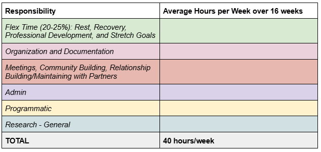
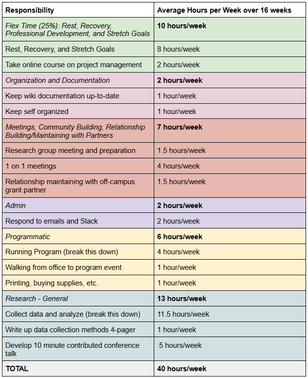
These are the general top-level categories that I start with:
How you approach using a tool in practice can depend a lot on you and who you are working with. Because project management tools can bring up fears of surveillance and micro-management, we must implement the tools within a larger group culture of mutual support and trust to achieve the goals we want them to achieve. In particular, we work to build a culture where we can be human, not take on too much, feel successful in meeting our goals, and share the load with one another.
Here is a way that I might move through this tool with a postdoc for the first time. I would schedule an initial 1.5–2 hour meeting with the postdoc. As the manager/mentor, I would do the pre-work of having filled out a draft of the table, although I might keep the draft on the side at first so as to not cognitively overload the postdoc.
People that I work with have told me that the single most important thing that this table does for them is to put boundaries on research time. Research is amorphous and it can feel like we are never doing enough. This table gives an amount of time that is “enough.”
Let me say this point again for emphasis: people that I work with have told me that the single most important thing that this table does for them is to put boundaries on research time.
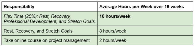
Flex Time
I would start with explaining the Flex Time category because it helps to convey our values. I would say something like,
“Fundamentally, we want you to be able to be a human in this group. We don’t think that you should be sitting at your desk 8 hours a day every day. You need to move your body, meetings can affect you, and sometimes the best way to move forward in research is to walk around outside. Many of our grants have to do with equity issues. Our scholars are often reading papers that relate to their own experiences. We want to encourage people to build in time for recovery from any negative impacts from their work. If there is frustration or conflict with co-workers, an inevitable result of being human, we want you to be able to have time to think through that. Finally, these positions rarely feel like 9 to 5 jobs. It can be hard to turn your brain off at a particular time. For instance, I regularly have thoughts about project management while walking my dog in the evening. We want this category to honor the ways that work sometimes stays with us outside of “work hours.”
Then, I would talk to the postdoctoral scholar about their professional development goals. I’d typically ask them if there are any goals that they already know that they want to focus on, as well as provide a holistic menu of options. For example, these are some common areas where people may be interested in new tools, training, or one-on-one support: project management/strategic planning, ergonomic setup, managing people, communication within teams, teaching, ethics, and self-education on disability justice, racial justice, or other ways of growing ourselves to be better community members.
Finally, I would convey our group’s approach to baseline and stretch goals:
“We want to help you set achievable goals. Your baseline goals are a meetable and concrete set of goals that take into account all of your commitments. You may have more goals beyond these that you don’t want to give up; these are your stretch goals. If your work goes smoothly and you’re feeling good, then you can use some of this flex time to meet your stretch goals.”
After this step, the table might look something like this:
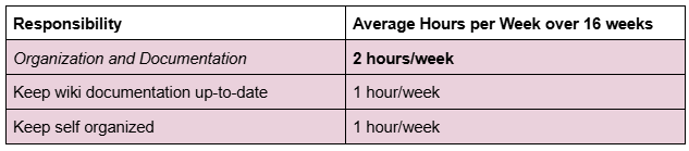
Organization and Documentation
I like having this category be explicit for our team members. My team is composed of mixed-method science education researchers that are trying to move collectively. We have a wiki where we document things like presentations, data collection, and community resources. It is important to build in explicit time for documentation so that researchers can contribute to our collective resources. We also honor the time it takes for any individual to keep themselves organized. After discussing this category, the table might look like this:
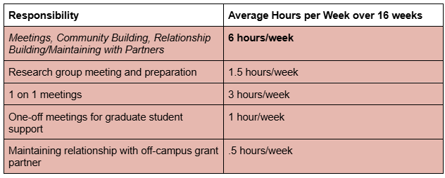
Meetings, Community Building, and Relationship Building/Maintaining with Partners
This category accounts for time inevitably spent meeting with team members and research groups. If any of the meetings require preparation work, honor that work here as well.
This category also allows us to emphasize the importance of community building within our research group. We want to be a place where people have time to lean on each other. It is also helpful for postdoctoral scholars to have some time set aside for graduate and undergraduate student support. This can help share the load with faculty.
The last part of this category is relationship building/maintaining with partners. Our science education grants often have a mix of programmatic and research elements. The programmatic elements frequently involve keeping up relationships with campus and off-campus partners. Too often this important work is overlooked, and yet it is key to effective grant partnerships. Our grant team looks at every on- and off-campus partner we have and assigns specific people to maintain these relationships. After filling out this category, the table might look like:
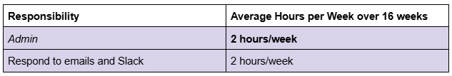
Admin
The admin category is fairly straightforward. It honors the time involved in responding to email and Slack queries. After this category the table might look something like this:
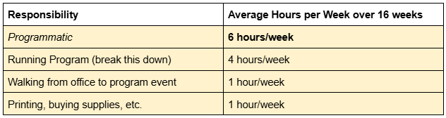
Programmatic
I often work on science education research grants that can have both research and programmatic components. This category allows for unpacking all of the elements of working on a mentoring program, an advocacy group, or whatever your program might be. I’m not going to spend too much time explaining this category because of how idiosyncratic it is. However, I do want to encourage you to think specifically and concretely about activities that might be overlooked. For instance, let’s say that you need to walk across campus to run this activity. You might end up walking about an hour across campus every week. This is the kind of activity that, if we overlook it, can really add up and mess with our understanding of how much time we have. Do you have to run to a store to buy materials? Do you have to photocopy things? Make sure that you’re accounting for as much as you can. After filling out this category the table might look like this:
Research - General
We have now arrived at the final category: research. I like leaving this category to last, not because it isn’t critically important for research grants, but because it helps us set realistic goals when we see how much time is left. Some aspects of research can be more amorphous than others. For instance, it can be difficult to predict how long writing and analysis will take, but it might be more straightforward to estimate the time needed for data collection. What this table allows us to do is bound the amorphous parts of research by hours rather than by progress. It allows someone to say, “I made progress for these hours, and now I will stop, even if I haven’t made a breakthrough yet.”
This can also be an opportunity to lower the load in other areas to be able to achieve bigger research goals. Again, somewhat like with programmatics, this category can be idiosyncratic to a team, or it may vary depending on where the team is in the research process (data collection, analysis, writing, etc.). Let’s not worry too much about the details here for now.
In this hypothetical table we have filled out, there are 13 hours/week left for research. I always like to make sure that there is a concrete product that researchers are planning to complete by the end of the semester. A concrete product helps people feel good about an accomplishment and can be an opportunity for the research group to engage with their work for feedback. In our mixed methods educational research, a writing goal can be anything from an analytic memo or data collection reflection to a full journal article. Presenting at a local or national conference is often a helpful concrete product that emphasizes larger community feedback.
Using the Table Throughout the Semester
We note that this table produces a global understanding of one’s responsibilities and an average week. However, it is rare that any particular week will look exactly like this average. There is additional work to do in mapping out one’s priorities by week. For instance, someone might have one week with a high data collection load. Other weeks might be spent traveling for conferences. Once these atypical weeks are mapped out, some math can be done to specify how much time should be spent on the amorphous parts of research in other weeks.
My recommendation is to use this table approximately three times per semester. Before the semester begins, the mentor and postdoc can have a conversation that leads to the table’s creation. Then, about a month into the semester, it is helpful to check in on the table. Did we completely miss something? Is the timing way-off on something else? This allows for some quick course-correction if needed. Finally, as the semester concludes, this table can be used to reflect on and celebrate the hard work completed. Once you have created a table like this, it is much easier to fill out going forward into new semesters.
The Table 2.0 - Planning for Atypical Weeks Like Conferences
I consider the use of project management tools to be an experiment that we are running. Every semester is an opportunity to improve our tools and understand our time better. If someone is new to project management, I might suggest that they start with the table, above, for a semester. Once the table is working we can consider additional complexity. Let’s explore one form of complexity for now: conference travel.
I find that scholars are not always aware of just how much presenting at conferences can impact their time. Conferences must be balanced with the day-to-day of research.
As one example, here is how I would estimate the time for a 3 day conference. Let’s assume two half-days of travel, which makes the trip take 4 days total. Then, let’s assume people move more slowly for another day when they are recovering from travel and interacting with people. We are up to 5 days total. 5 days at 8 hours/day is 40 hours. Then, divide 40 by 16 weeks of the semester and we get an average of 2.5 hours/week. Going to a conference is equivalent to 2.5 hours/week of research going somewhere else. This type of analysis can help you balance conferencing with other research goals.
If you want a little reading break, now is a good pause point. Next, we will explore a postdoc’s experience using the table in practice.
Reflections on Using the Table in Practice
Dr. Fatima Abdurrahman and I worked together on a National Science Foundation grant. I asked Fatima to join in sharing her experience because I think that we really got the table to work effectively for her in some ways. Fatima was a postdoc working for our grant team for 20 hours/week, with a significant programmatic component to her job responsibilities.
To help make sense of Fatima’s experience, I will share just a few background points. When Fatima and I completed her table for the first time, we recognized that she had 4 hours/week for research. She also was not planning on conference travel that semester. We discussed that this meant that, realistically, she had one afternoon a week for research. I recall feeling excited when Fatima told me that she was able to set down her research and let it go, and that the table helped her do that. Additionally, Fatima has been running her own YouTube business. This means that she came into our project team already having thought about how to organize her time. I think that it would have taken longer to get the table working in the way it did for someone with less experience in time management as compared to how long it took Fatima.
Fatima’s Experience
I benefitted immensely from Angie’s Weekly Average Overview Table. Most significantly, this system has helped me mitigate the anxiety I experience associated with work productivity, which comes up in feelings of “not doing enough” and often overworking to compensate. The clear expectations communicated in the Overview Table gave me a concrete point at which I could say I’ve “done enough,” after which I could walk away from work and not stress about it until the next work day. And while this initially looked like me doing the minimum work designated by the Table, within a few weeks of this much healthier headspace, I found that I often had the motivation, energy, and genuine desire to go above and beyond and make progress towards stretch goals—goals that no one expected me to accomplish. In other words, this framework gave me the space to alleviate my productivity anxiety, which then, counterintuitively, gave me the capacity to produce much more than I would have expected.
A quick Angie interjection: Just to say it out loud, I would have been completely happy as an advisor if Fatima had only accomplished her baseline goals and made no progress at all on her stretch goals. The goal here isn’t to get people into more productivity—it is to support them in feeling good about their work. Back to Fatima:
Additionally, the Overview Table was an extremely helpful tool in organizing my own time. For example, I generally have a habit of constantly checking my email, easily dozens of times in a day, often taking away momentum from other, deep focus-requiring work tasks. However, in the Overview Table, we allotted a specific amount of time for that task (1.5 hours), which I built into my schedule in the form of dedicated email checking periods at the beginnings and ends of my workday. The allotted time was generally more than enough to get the task done, and in the case that it wasn’t, we would have identified that I needed to allot more time to that task. In this way, the Table helped me materially organize my schedule more effectively and realistically, leading to a workflow that made the most of my working hours.
Overall, Angie’s Weekly Average Overview Table was a massively helpful tool, both mentally and materially, that I will continue to use in other positions and share with colleagues after my time on Angie’s team.
Conclusion
In closing, I hope that we have provided you with a helpful tool, or at least some ideas to spark your own creativity. Building a collective and sustainable community is hard and important work.
If you would like to try to use this tool yourself, you can find a template table here.
If you would like to share your experience, excitement, or constructive criticism please comment below!
Acknowledgements
This written resource was funded, in part, by: Angela Little LLC, the National Science Foundation (#2224295 and #2224296) and the Michigan State University Jenison Fund Career and Research Continuity Support program.
Dr. Little honors the communities that she has been able to dream and grow within: the Compass Project and Access Network communities, the NSF Transfer Advocacy Groups grant team, the Michigan State University research groups in Physics Education Research that she has been a part of (ANSER, S-STEM, and PSST!), and the Society of Indigenous Physicists community. She also honors the personal work she has engaged in as a small business owner to understand her own time and support others to do the same. And a special shout out to Dr. Vashti Sawtelle—we dreamed a Research Lab Steward position for me into the world, and it has been a beautiful thing.
Thank you to the following people who gave feedback to this written resource: Vashti Sawtelle, Missy Cosby, and Gina Quan